The concept is simple, the implications are huge
Every marketing channel follows a curve of diminishing returns. The first £10,000 in social media spend might deliver a strong return. The next £10,000 delivers less. Eventually, additional spend barely moves the needle. The question is: where's the inflection point for each of your channels?
This isn't theoretical. A brand we worked with was spending heavily on television across all dayparts. Meanwhile, their paid social budget was still delivering strong returns per pound invested. But when we looked at the full picture, they were putting incremental budget into the weakest channel while ignoring the strongest one. They'd already hit the saturation ceiling on TV. There was no more headroom. Every additional million pounds on television was generating diminishing returns, while their social channel had room to scale.
This pattern is common because it's invisible without proper analysis. Your TV spend looks healthy. Your social spend looks healthy. But what matters isn't the absolute numbers—it's where each channel sits relative to its saturation point. One channel might be under-invested despite the budget you've already allocated. Another might be well past optimal spend despite looking like it's performing.
What saturation curves show
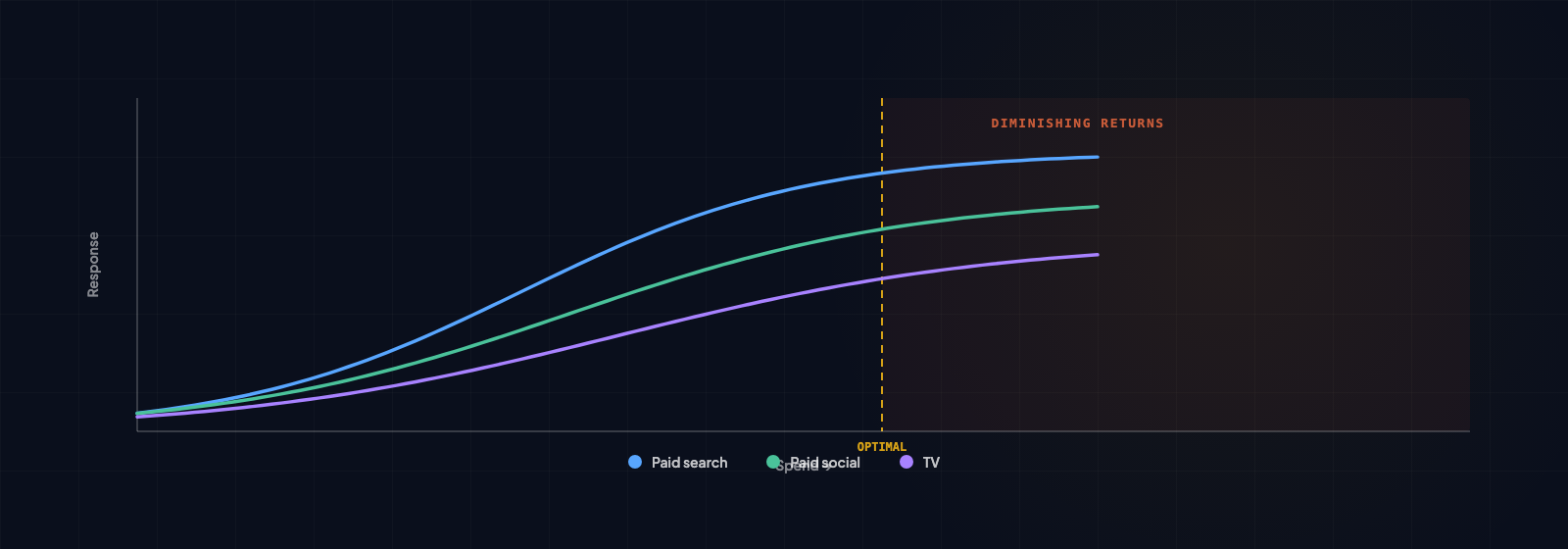
A saturation curve is an S-curve (or more precisely a Hill function). The X-axis is your spend in a channel. The Y-axis is your response—conversions, sales, leads, whatever outcome you're measuring.
The shape tells the story. The curve rises steeply at low spend levels. This is the efficient zone. Your first pound of investment generates strong returns. As you increase spend, the curve continues to rise, but it gradually flattens. At some point, the curve becomes almost horizontal. Additional spend moves the needle very little.
The "Goldilocks Zone" is where you're getting the best marginal return. It's past the minimum effective dose (where you've invested enough to move the channel) but before the curve flattens (where you're past optimal spend). In this zone, each additional pound generates reliable returns without the drag of saturation.
If you're well below saturation, there's headroom. You can invest more and expect proportional growth. If you're well above saturation, you're wasting money. Every additional pound generates minimal response. If you're in the Goldilocks Zone, you've got the channel optimized.
One of the most common findings in MMM is that brands are simultaneously over-spending on one channel and under-spending on another. Saturation curves make this visible.
Why this matters for budget decisions
This is where saturation analysis changes how you allocate budget. If your TV spend is well past the saturation point, every additional pound is generating diminishing returns. You might be getting a 2:1 return when you're well-invested, but a 0.5:1 return when you're over-invested. The incremental pound isn't worth it.
Meanwhile, if your social spend is still on the steep part of the curve, there's headroom. The next pound of social investment might still generate a 3:1 return. The curve is still rising steeply. There's room to scale.
This is how you find free growth without increasing total budget. You don't move money randomly. You move it from channels where saturation means it's not working well to channels where there's still headroom. You're not guessing. You're reading the curves and following where the math points.
A financial services brand we worked with was allocating budget proportionally to historical performance. They spent the most on the channels that had performed best historically. But saturation analysis showed their strongest historical channel had flat-lined. They were past the optimal spend point. Their emerging channels still had steep curves. By reallocating 15% of budget from their historical winner to their emerging channels, they increased total revenue by 8% without increasing total spend. The saturation curves showed exactly where to make the move.
Different channels saturate at very different rates
This is important: channels don't all behave the same way.
TV and out-of-home (OOH): These typically have high saturation ceilings but require large minimum spend to work at all. You can't run a meaningful TV campaign for £50,000. You need scale. But when you have scale, TV can absorb massive spend before saturation kicks in. A national broadcaster can spend millions before the curve flattens significantly. The trade-off is that you need scale to be efficient at all.
Paid search: This saturates relatively quickly in most categories. Why? Because you're bidding on a finite set of searches. There are only so many people searching for your category in a month. Once you're bidding on most of those searches, the only option is to pay more per click (bid higher) to reach additional volume. You hit saturation faster than in other channels. But you hit it efficiently—each incremental pound tells you it's not working anymore because cost per acquisition rises visibly.
Social advertising: This often has more headroom than brands expect, especially for reach objectives. The audience is enormous. You can run reach campaigns for months and still find new people. But saturation matters here too, especially for conversion campaigns. If you're using social to drive direct conversions, you'll hit a saturation point where additional spend starts generating higher cost per conversion. If you're using it for awareness, the curve is much flatter and stays efficient longer.
Digital display: This frequently shows early saturation. There are only so many times you can show an ad to the same person before they tune it out. If you're buying display on a limited set of sites, you'll run through the efficient inventory quickly. The first £100,000 in display might work well. The next £100,000 hits diminishing returns faster because you're showing ads to the same audience repeatedly.
How to read a saturation curve
If you're looking at saturation curves for your channels, here's what matters:
Where are you currently on the curve? This is your current spend and the response you're getting. Are you at the bottom of the steep section (room to grow)? In the middle of the Goldilocks Zone (optimized)? On the flat section (past optimal spend)? This single point tells you the most about whether your current investment makes sense.
How much headroom remains? If you're still on the steep part, how much spend can you add before you hit saturation? Some channels show headroom for 30% additional spend. Others show headroom for 100%+. This tells you how aggressive you can be in scaling.
What's the optimal spend level? The curve peaks (or the "Goldilocks Zone" is widest) at a certain spend level. That's approximately where you want to be. Not always exactly—sometimes you want to be slightly under-invested if you're uncertain. But the curve gives you a target.
One important note: being "well below saturation" can be good (room to grow) or bad (below minimum effective dose). Some channels need critical mass. If you're underspending because you're afraid of saturation, but you're below the minimum spend needed to make the channel work at all, you're wasting what little you are spending. The curve tells you this—if you're on the flat, inefficient section at the bottom left of the curve, the answer isn't to spend less. It's to spend enough to get into the steep section, then optimize.
The practical application
You don't need to be a statistician. The output is simple and actionable.
For each channel, you get a curve showing current spend versus optimal spend. The curve is color-coded or labeled to show whether you're under-investing, over-investing, or in the sweet spot. Some channels will light up with obvious headroom—"This channel has room for another 40% spend and will still generate strong returns." Others will show obvious saturation—"This channel is past optimal spend. Reallocating budget would improve overall ROI."
From there, the budget move becomes straightforward. You work backwards from saturation. Reduce spend on over-saturated channels by the amount you need to free up. Increase spend on under-saturated channels up to their optimal point. The curves tell you exactly how much to move and in which direction.
A consumer goods brand applied this last year. They had six major channels. Saturation analysis showed two were well past optimal spend (generating diminishing returns), two were in the Goldilocks Zone, and two had significant headroom. They reallocated 18% of budget from the over-saturated channels to the under-saturated ones. Within two months, they saw a 12% increase in total revenue from the same budget. No increase in spend. Just smarter allocation guided by saturation curves.
Why this changes the conversation with leadership
Most budget meetings happen without saturation data. Someone argues "Our paid search channel should get more budget because it's performed well historically." Someone else argues "TV brand-building is essential, we need to maintain our spend." No one can point to data showing the actual relationship between spend and response for each channel. So the conversation becomes political. Whoever talks last or has the biggest reputation wins.
With saturation curves, the conversation changes. You can show exactly what additional spend will generate in each channel. You can show which channels are working hard (still on the steep part of the curve) and which are coasting (flat section). You can show where reallocating budget will improve overall results. It's no longer an argument. It's a data-guided decision.
The first time a CMO sees saturation curves for their channels, the response is usually "Why didn't we know this?" The answer is that it requires proper analysis. Traditional dashboards show performance. They don't show saturation. Attribution models show which channel got credit for which conversion. They don't show optimal spend levels. Only econometric modelling, specifically saturation curve analysis, reveals this. And it's worth knowing.